Let every day produce some curious Lines
Which may advance thy Genius and thy pen
Let all thy Undertakings and designs
Tend to God's Glory and the good of men.
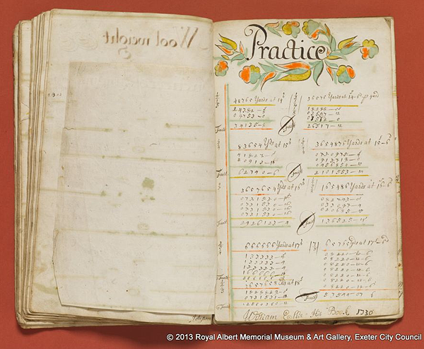
This exercise book once belonged to William Ellis, an artistic young student who was studying his arithmetic lessons. It was excavated in Exeter, England years ago and now sits in the Royal Albert Memorial Museum archives. Ellis began his book in 1729, and filled it with his calculations, measurements, flourishes and ornaments. He then hand painted the same three additional colors onto each page with great attention to detail. Many pages had colorful display headings with birds, flowers and medieval-looking creatures. His hand-lettering skills were capable, but "needs improvement" as any teacher might well suggest. Neatness was not his strongest suit.
Exercise books in Georgian England were commonly used by school children to practice lessons plans while perfecting their art and valued penmanship skills. These talents indicated you were a literate person of culture and good standing. All learning had great value and was considered virtuous. Creating beautifully illustrated lesson books with polished hand-lettering was intended to honor content, while building good character.
It's always interests me to see how the student of handmade and lettered books would often parody the layout of traditional books by creating large headings, and decorated initial caps to announce the title or text. They comprehended the principles of how we read. Although there appears to be no contents page, Ellis did add small page numbers to the upper right-hand corners of each page for ease of navigation. It's revealing to see how he tried to contain each topic to a single page which takes a certain degree of organizational skills, but his calculations would often spill onto the facing page or into the margins. His wonderful illustrations have a folk style charm, and the freshness of a skilled draftsman with a bent towards fantasy illustration. Especially true of the unicorn and the polka-dot sailing ship. In the heading for "Subtraction" seen below, he portrays the letter S as a dragon.
Although there is no record of the age of William Ellis when he made this book, there is little doubt he was a young student. I hope he received high marks for his work and continued his artistic endeavors. I would love to have seen an entire alphabet of his initials with birds and flora. Are those real feet on the letter M? You can visit his entire book here which has slightly larger images.
Although there is no record of the age of William Ellis when he made this book, there is little doubt he was a young student. I hope he received high marks for his work and continued his artistic endeavors. I would love to have seen an entire alphabet of his initials with birds and flora. Are those real feet on the letter M? You can visit his entire book here which has slightly larger images.


This comment has been removed by a blog administrator.
ReplyDeleteWhoops! So sorry Lesley, but I just noticed that I accidentally deleted your message when on spam patrol earlier. Here it is again:
Delete"How wonderful, I didn't know about the RAMM online museum even though we often go in there! Thanks for the link"
You're most welcome! From what I've seen of their online archives, it must be a treasure of a museum.
Hi, I've just been sent a link to you from Susan Gaylord's blog. I too live near Exeter and visit RAMM from time to time! One day I'll ask if I can have a look at this book it looks wonderful. Thanks for sharing lots of lovely lettering stuff….off for a browse through your past posts now..
ReplyDeleteFun! It would be interesting to know if they have any more exercise books in their archives. I've seen some fascinating examples in other private collections. Happy you found Letterology!
DeleteThose initial caps are just amazing, love their sort of languid cheeriness.
ReplyDeleteThis blog is the best.