Tuesday, December 30, 2008
Typography Is
From Spatium magazine comes a book about what typography means for various designers. Click on book for full screen.
Monday, December 29, 2008
Monday, December 15, 2008
Sunday, November 30, 2008
New From Penguin Books
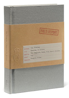
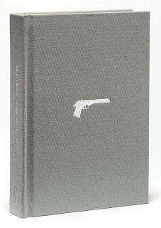
Pentagram designer's, Angus Hyland and Fabian Herrmann have designed the hardback edition of Penguin Books Quantum of Solace: The Complete James Bond Short Stories. The book collects together all of Ian Fleming's Bond short stories in a single volume. Hyland created a cloth-covered hardback with cover imagery restricted to a silver foil stamped image of Bond's infamous Walther PPK. A subtle diamond pattern is debossed on to the boards, which combined with deep burgundy endpapers evokes the discerning elegance of Bond's world. An embossed manila bellyband with typewritten cover information on the label evokes the official documents of the period. Click on image to enlarge.
Friday, November 21, 2008
ObamaBats
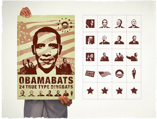
Bring some change to your artwork. Download a free True Type set of Obama Dingbats and hope for some great designs we can all believe in this next year.
Sunday, November 16, 2008
Saturday, November 8, 2008
Type Class Warfare
An international type conference gathers to consider the inclusion of Zapf Dingbats when the crooked, villainous, Ransom decides to hold Courier, and his daughter, Curls MT, hostage. Suspense mounts. Can't all types just get along?
Friday, November 7, 2008
An Evening With Hatch Show Print's, Jim Sherraden
Enjoy a lecture and exhibition tour with Hatch Show Print designer Jim Sherraden in honor of EMP|SFM's newest exhibition, American Letterpress: The Art of Hatch Show Print. Sherraden will lead a presentation on letterpress and the history of HATCH SHOW PRINT, America's longest-operating print shop. Following the presentation, guests are welcome to attend a special tour of the exhibition and a chance to meet Sherraden to continue the conversation about Hatch Show Print.
Wednesday, January 14, 2009 7:00 pm.
Experimental Music Project--JBL Theater
325 5th Avenue North
Seattle, WA 98109
Ticket Info:
Free to EMP|SFM and AIGA members; $5 general public, 206.770.2702 or 1.877.EMP.SFM1. Reserved seats unclaimed 10 minutes prior to the event are subject to be released to the wait list.
Sunday, November 2, 2008
Type Goes Electric
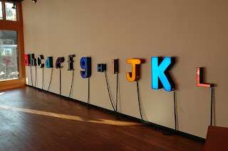
Gather Gallery in Columbia City is having a show of Jeremy Bert's neon type. Bert has assembled a complete alphabet of abandoned neon letters which he acquired from old advertising signs. Each letter has been rewired and is available for sale. The show is up until November 23rd and you may go here for more info.
Tweak This
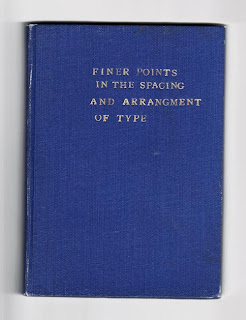
Before Robert Bringhurst, there was Geoffrey Dowding. U&lc online magazine recently listed Dowding's notable book, Finer Points in the Spacing and Arrangement of Type as one of the ten essential books on typography for a designer to own. Perhaps the designer of this cover may have benefitted from reading this treasured book.
Friday, October 31, 2008
Inhale Exhale
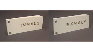
The work of artist and paper engineer, Matt Shlian intersects the disciplines of math, science and art. He is a master at creating kinetic art and folding paper. See many samples at his site and a video of his book, Inhale Exhale here And his links page shows a great sample of presenting navigation visually.
Tuesday, October 28, 2008
Vintage Typography Dig
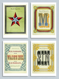
Here you will find an archive of many beautiful examples of vintage and retro typography. It's like a graphic archeological dig! These 4 lovely examples of expressive typography are notecards of W.H. Page Wood Types. They are published by the RIT Cary Graphic Arts Press. and available for purchase.
The Next Page: 30 Table of Contents
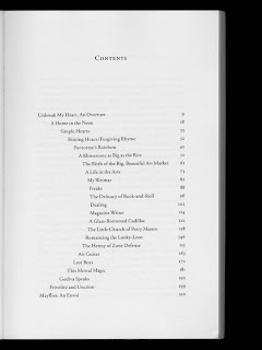
Here is the link to the slide show of Table of Contents pages provided by Design Observer. This was originally produced as a book in response to AIGA's 12th Biennial Design Conference in Denver by noted designers, Michael Beirut, William Drentell and Jessica Helfand. In it, they considered how we all navigated through a book and how we each consider what we read next. In the realm of the printed word, they go on to explain how the humble TOC is our portal into a world of knowledge and heralds what comes next with its own peculiar prose and typographic conventions. Take a look at this collection and ask yourself what works and why.
Saturday, October 25, 2008
The Fell Types


The Fell fonts from the 17th C are available free here. Well, nearly free. The deal is you should credit Igino Marini, the fellow who digitized them all. If you want to use any of them in publications of any kind of media you have to put in the following quote as a note: «The Fell Types are digitally reproduced by Igino Marini. www.iginomarini.com» and let the designer know where you used it. These are great fonts and beautiful ornaments but should be used carefully because of their historic nature. The original fonts, designed in the 1600's, were available in various point sizes. Now that they have been digitized by Marini, it is best to not stray from these intentional sizes too much, as it effects the readability of them. You can read more about the Fell fonts and download all of them in OpenType format at his website.
Sunday, October 19, 2008
The Road to Clarity
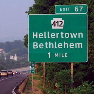
Learn how readability effects all of our lives. Designer Don Meeker speaks with Kurt Anderson of Studio 360 radio program about the redesign of interstate road signage. Meeker set out to improve the readability of the signage by developing the new font, Clearview. By changing some of the stroke widths and opening up the counters in various letters, the face becomes far more readable at a distance and at night. This subtle change in typography will make a dramatic effect upon reducing the number of highway fatalities each year. Good typography can save lives! You can learn more about this story, Design for the Real World here and here.
Tuesday, October 14, 2008
InDesign Tips for Book Production
If you need more InDesign help with your book production, the Adobe InDesign Resource Center may be of great help to you. Here you will find links and videos and other great resources related to working on long documents. For instance, if you go to Text > Find/Change, you can even find a chart for performing GREP searches using Metacharacters. You can also download custom glyph sets by going to Text > Glyphs and special characters. If you need assistance for setting up page numbers in sections or your entire document, there is even a good video on this. It indicates a great way to update all the page numbers for each chapter or section of your book as you work on your document. However, you should disregard the last tip in the video on inserting variables to automatically update your various chapter numbers. According to Chris Sullivan, there is a glitsch in our InDesign CS3 over the network and it's best not to use this option for now.
Tuesday, October 7, 2008
The Art of Hatch Show Print
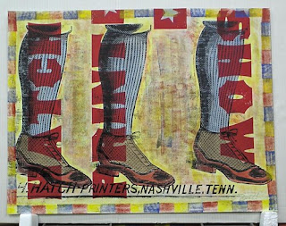
Nashville's Hatch Show Print will have some letterpress posters on exhibit at the EMP|SFM beginning October 11th. Hatch is one of the nation's oldest printing shops and has been in operation since 1879. The exhibition will feature some great American entertainment posters that are printed on large presses with wood type and blocks. On the opening day there will be a letterpress workshop at the museum from 11 to 3pm. The exhibit is open from 10 to 5pm daily, and costs a whopping $15 to attend. (Although I believe it is free on First Thursdays of every month from 5 to 8pm). The show continues through July 16th.
Friday, October 3, 2008
ABC3D
This short YouTube video is of an amazing interactive book entitled ABC3D, designed by French graphic designer, Marion Bataille. The book is about to be released in the US on October 14th and will be available on Amazon for $14. I came upon this gem at an exhibit of Dutch Book Design at the Stedelijk Museum in Amsterdam this past Summer. The voiceover and acting is by yours truly. Hey, it was done on the first take!
The Donald Does Design
Who knew at the intersection of math and design you would find Donald Duck? Disney and his incredible crew of animators took on the Pythagorean Theorem and the Golden Rectangle in this remarkable 1959 production, Donald in Mathmagic Land. It was originally a 30 minute cartoon, and has been divided into 3 parts for YouTube. The first and second part address the simple elegance of the Golden Section or Rectangle and how it's found in art, nature, music and even games. Mr. Spirit from Mathmagic Land doesn't give mention to any book design applications, but one could see how it could be easily adapted. Check out Part 1 and Part 2 for more on this topic, and Part 3 for good measure (and the art and math of billiards). Thanks Aaron for mention of this great piece!
Canons of Page Construction

Leave it to Wikipedia to offer some wonderful references and links for various sets of principles of page construction.
Penguin by Designers
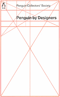
It's not often that a book cover addresses the actual design of books, but this Penguin cover has done so nicely. This paperback, designed by David Pearson, was issued to commemorate Penguin's 70th anniversary event at the Victoria and Albert Museum in June 2005. It illustrates the famous grid for a Penguin book cover which was originally designed by Romek Marber. The book itself is a limited edition of collected transcripts from many of Penguin's notable designers who held a seminar at the V&A on Penguin's publishing history. This book is available only here if they have any left.
Thursday, September 18, 2008
Wednesday, September 17, 2008
Importing Text from Word Files
Here is a great link on importing Word documents into InDesign written by Seattle's most noted book designer, John Berry. Here he explains some tips on how to avoid common formatting issues before you import these Word files. http://www.creativepro.com/article/dot-font-importing-text
Monday, September 15, 2008
Textbooks
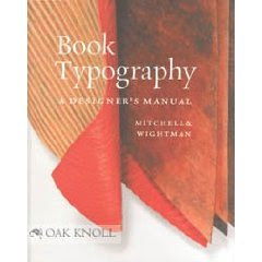
Your first assignment is to order these two required textbooks: The first is Book Typography, A Designer's Manual by Mitchell & Wightman, Libanus Press, 2005. It can be ordered from Amazon or Oak Knoll Books for $69.95. This book is a practical guide to typography and explains the principles of good design, why they exist and when to put them into practice. It is an essential text for any print designer who wishes to create professional grade page layouts.
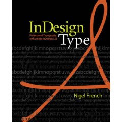
This second book, InDesign Type, by Nigel French, and published by Adobe Press in 2006, focuses on InDesign's sophisticated typographic controls and formatting features. It does a great job on explaining many of the time-honored typographic conventions of magazine and book publishing. Although it is written specifically for CS2, the majority of the techniques are applicable to later CS versions. This book holds up very well over time.
Subscribe to:
Posts (Atom)


